Truth
Grounded
Every factual, historical or textual claim carries a citation. If it cannot be verified, it is not said.
Brand guide · v3 Phase Two · October 2026
The official identity of Apologetics Nigeria. Logo, colour, type, light, components, motion and voice, with the design tokens that build the website and the printed profile. Every colour value on this page is read from the live stylesheet.
01 · The idea
The identity is built on one verse and one discipline. The verse sets the purpose. The discipline, giving the strongest form of a view before answering it, sets the look.
Always be prepared to give an answer to everyone who asks you to give the reason for the hope that you have. But do this with gentleness and respect.
1 Peter 3:15
How the look carries it
The ground
Ink, never pure black. The place where hard questions get asked out loud. Nothing on the page competes with the argument.
The two lights
Two sources on one subject. The tradition and the objection, both given real light before anything is concluded. The steelman, made visible.
The type
Newsreader reads like a well-made book: scripture, history, argument. Jost runs the interface. Oswald appears only on posters.
Four principles
Every factual, historical or textual claim carries a citation. If it cannot be verified, it is not said.
Gentleness and respect. Other faiths and critics are represented accurately and at their strongest, never caricatured.
Note-style. One idea per line. No filler pages, no padding, no em dashes.
Black and white, soft light, slow motion. The design never shouts over the content it carries.
02 · Logo
An A and an N cut from two solid blocks. The only hard angles in the whole identity live inside these cuts, so the mark always reads as the one fixed point on a soft page.
 Primary · white on groundWhite on ink
 Black on paper · print and light grounds
Lockup
Apologetics NigeriaMark plus the name in Newsreader 400, sentence case. Ratios are measured from the live site header, so every lockup matches it:
Clear space
x is the height of the mark. Keep 0.4x clear on every side: no type, edge, image or other logo inside that zone.
The master file, logo.png, already carries at least 0.4x on every side (0.40x left and right, 0.86x top and bottom). Placed whole, it brings its own clear space. Use the trimmed logo-mark files only when you set the clear space yourself.
Size and colour
Screen minimum
The size in the site header. Never smaller on screen.
Print minimum
Below this the inner cuts close up on uncoated paper.
Colour
White on every dark ground (the site inverts the black master). Black on paper. Nothing else.
Stacked mark

A over N, white on black. App icon and favicon only.
Do not
Apol. NGFiles
| File | What it is | Size | Use |
|---|---|---|---|
| logo.png | Master mark, black, with clear space built in | 4080 × 2295 | Default everywhere; invert for dark grounds |
| logo-mark.png | Trimmed mark, black, no padding | 3371 × 878 | Print and layouts where you set clear space |
| logo-mark-light.png | Trimmed mark, white, no padding | 3371 × 878 | Dark design work outside the website |
| favicon.png | Stacked mark on black, rounded | 256 × 256 | Browser tab |
| apple-touch-icon.png | Stacked mark on black, full bleed | 180 × 180 | Phone home screen |
| signature-logo.png | Email signature lockup, dark and light versions | 300 × 78 | Email only, by absolute URL |
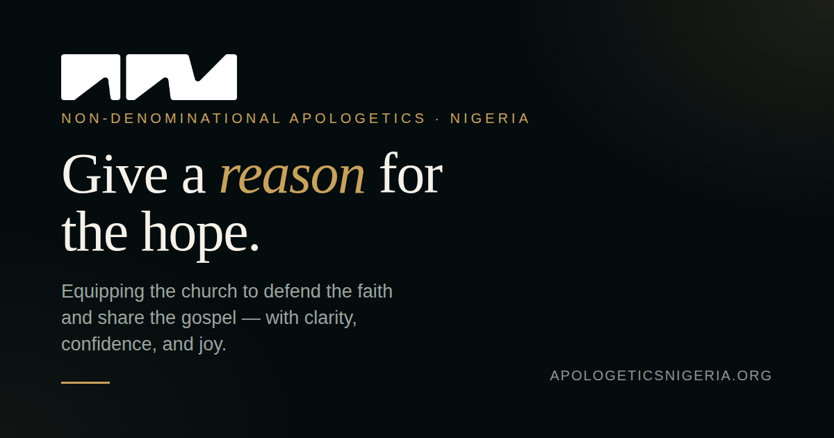
| og-image.png | Link preview card | 1200 × 630 | Social and messaging previews (see open items) |
| og-home.jpg · og-resources.jpg · og-events.jpg · og-give.jpg | v3 link preview cards, one per main page | 1200 × 630 | og:image on Home, Resources, Events and Partner |
03 · Colour
The palette is ink and paper. Colour enters a page only through light and through photography. There is no brand hue to apply to type, buttons or shapes.
Guide proportion for a typical screen, not a rule to measure.
Ground
--ink#111214The page ground. Never pure black: #111214 keeps shadows soft and photographs breathing.
--ink-2#17181BRaised ground: poster cards, select menus, image wells.
--ink-3#1E2023Highest ground. Use sparingly; most raising is done with glass and line, not a lighter fill.
Text
--paper#F2EFEAHeadlines and primary text. Also the fill of the solid button and the menu button.
--soft#C9CCCFLeads, body copy, form labels. The default reading colour.
--mute#A9AEB3Eyebrows, metadata, secondary lines, captions.
--faint#8C9298Fine print, footer labels, placeholders. The lowest text colour allowed.
Every text colour passes WCAG AA on every ground, including the brightest point of the warm light (faint is 4.70:1 there). Text never goes below faint. Pure white appears only as a hover state.
Lines and glass
--linergba(242,239,234,.12) Over ink: #2C2D2EHairlines: dividers, card edges, table rules. Decorative, so no contrast minimum applies.
--line-2rgba(242,239,234,.32) Over ink: #595958Pill, chip and glass button borders. Buttons are identified by their text, not this edge.
--line-3rgba(242,239,234,.6) Over ink: #989794Hover and focus edges. The only line strong enough to carry meaning on its own.
--glassrgba(255,255,255,.035) Over ink: #191A1CSurface tint for tiles, ticker chips and the hover state of dashed cards.
Lines are paper at low opacity, so they take on whatever light sits behind them. Graded against the 3:1 minimum for interface edges.
Light
--warmrgba(122,84,52,.30) Over ink: #30261EThe lamp from the left. Lives only in gradients, never as a flat fill.
--coolrgba(48,70,104,.34) Over ink: #1C2431The lamp from the right. Lives only in gradients, never as a flat fill.
Signals
--err#F0B8B1Form errors only. Always with words that say what went wrong.
--ok#BFD8C4Form confirmations only.
Accents, in use but not yet tokens
not a token#E3C9A4Italic turn on warm event cards (Defending the Faith), founder role line in print. Written as a literal today.
Proposed token:--accentnot a token#C8D2E0Italic turn on cool event cards (Opened Veil). Written as a literal today.
Proposed token:--accent-coolTwo pale tints pick up each event's light in the italic half of a headline. They are allowed only there and in print captions, and never as a fill, button or rule.
Retired
Teal, cyan, yellow, red. Kept only in the Defending the Faith 2026 attendee pack as a record.
Parchment and gold. Still in v2.css, now loaded only by the certificate page and as the source of v3-legacy.css. Do not use in new work.
04 · Type
All three are self-hosted in /assets/fonts and declared once in the tokens file. No other face appears on a v3 page.
The signature move
Give a reason for the hope.
A roman statement, then an italic turn in Newsreader 300. One turn per headline, on the word that carries the meaning. Never a whole line in italic.
Scale
.displayNewsreader 400 · clamp(58px, 9.6vw, 148px) · lh .98 · −.022emPrint · Cover 58pt.phero-titleNewsreader 400 · clamp(56px, 8.4vw, 128px) · lh .98 · −.022emPrint · h1 46pt.h2Newsreader 400 · clamp(40px, 5.6vw, 84px) · lh 1.03 · −.018emPrint · h2 31pt.h3Newsreader 400 · clamp(28px, 2.6vw, 36px) · lh 1.08Print · h3 15pt.lead--lgJost 300 · clamp(18px, 1.6vw, 22px) · lh 1.6 · max 54chPrint · lede 10.6pt.leadJost 300 · clamp(17px, 1.4vw, 19px) · lh 1.6 · max 56chPrint · p 9.4ptbodyJost 400 · 16px · lh 1.5Print · p 9.4pt.eyebrowJost 400 · 14px · uppercase · +.22em · mutePrint · eyebrow 7.4pt.fineJost 300 · 13px · lh 1.55 · faintPrint · small 7.6pt.t-condOswald 600 · clamp(26px, 12.5cqi, 52px) · uppercase · lh .92 · posters onlyPrint · Posters onlyRules
text-wrap:balance; leads stop at 54 to 56 characters a line.mono) so they do not jitterAlso in the repo and not part of v3: Archivo and IBM Plex Mono (v2 only; the certificate moved to v3 in October 2026), Bodoni Moda and Inter (2026 attendee pack), Cinzel and Michroma (Opened Veil artwork only, never set as live text).
05 · Light
Light is the only colour the identity owns. It is always two soft sources, always in the same places, always low. The hero adds a third: a lamp that follows the reader's pointer.
The recipe
| Layer | Colour | Position | Size | |
|---|---|---|---|---|
| Warm key | rgba(122,84,52,.30) | 12% 2% | 1100 × 760px | .36 |
| Cool key | rgba(48,70,104,.34) | 92% 8% | 1000 × 760px | .40 |
| Warm fill | rgba(110,74,46,.15) | 6% 52% | 1200 × 900px | .16 |
| Cool fill | rgba(44,64,96,.22) | 96% 78% | 1100 × 900px | .22 |
| Lamp | rgba(242,232,214,.16) | Follows pointer, eased 8% a frame | 520 × 420px | None |
Rules
06 · Components
Everything below is the real v3.css class, rendered live. Build new pages from these before writing a single new rule.
Buttons
.btn--solid is the one primary action per view. .btn--glass for everything else. Minimum height 44px, always a full pill.
Pills and chips
.pill labels state (dates, status, category). .pill--quiet for the softer second label. .chip holds a countdown figure. Pills are labels, not buttons: they carry no action.
Cards
Statistic card. Serif figure, Jost explanation, source pinned to the foot.
Source · always named
Pill top left, ghost numeral top right, title pinned low.
Panel
The large surface
Radius 28px. Holds a whole idea: a profile, a form, a quote.
One card recipe: paper at 3% opacity, a 1px --line edge, radius 22px (--r-card). In print the same card is .card: .25mm edge, 5mm radius.
Rules
1px var(--line)Event cards
Forms
Rounded 14px fields on a 26px form panel. Labels sit above, never inside.
Lists
07 · Blend masks
Art dissolves into the ground instead of sitting in a box. Every image on a v3 page fades out at its edges through a CSS mask, so photography and the light belong to the same room.
Hard box. Never on a v3 page.
no maskCard art. Solid to 72%, fades to the foot; 6% side fades.
.feature-art img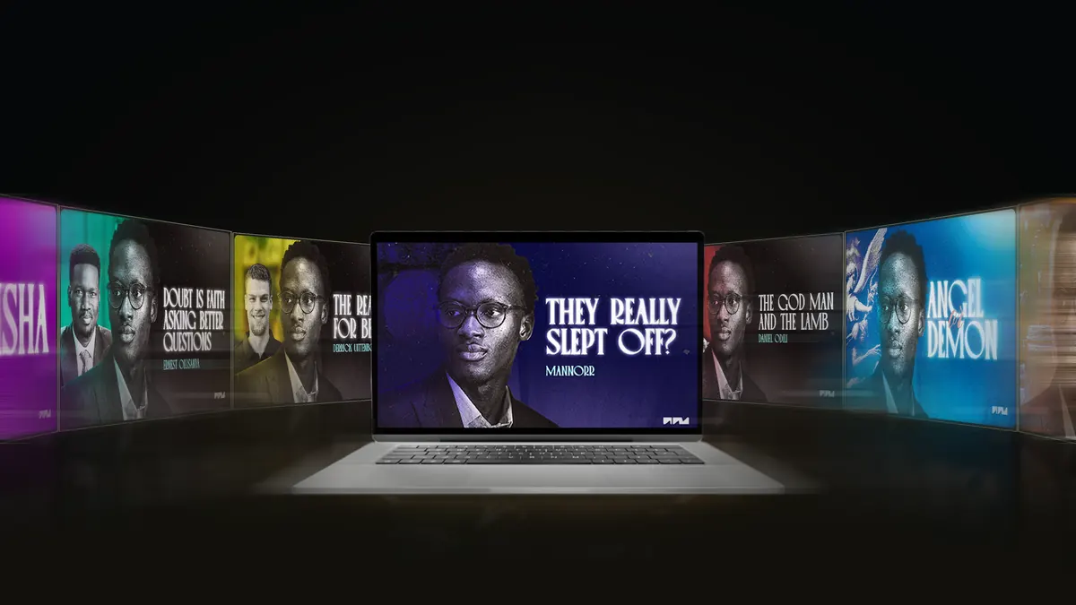
Stage. Fades on all four edges for hero art.
.hero-stage imgEvery mask in the system
| Class | Vertical | Horizontal | Where |
|---|---|---|---|
.hero-stage img | 0 → 26% … 72% → 100% | 12% … 88% | Homepage hero art |
.feature-art img | solid … 72% → 100% | 6% … 94% | Event cards |
.poster .course-thumb | solid … 60% → 100% | 7% … 93% | Video posters |
.fade-edges | solid … 78% → 100% | 7% … 93% | Any loose image |
.blend (print) | solid … 66% → 100% | 7% … 93% | Profile portraits and event art |
.blend-all (print) | 0 → 24% … 74% → 100% | 12% … 88% | Profile cover |
Masks come off the moment a video plays (:has(iframe)): a playing film gets its full frame and a 22px radius. Always set the -webkit- pair alongside the standard property, as v3.css does.
08 · Layout and shape
One container, one gutter, generous vertical rhythm. Every corner is rounded; the logo's cuts are the only sharp angles.
Container
--max · narrow pages 1100px (.wrap--narrow)
Gutter
--gutter: clamp(16px, 4vw, 56px) plus safe-area insets
Section rhythm
.sec · tight sections 32 to 56px (.sec--tight)
Gaps
.g-14 to .g-28 inside stacks; 16 to 24px between cards
Radius scale
The slanted corner cut used on v2 buttons and cards is retired from the interface. Phones first: every grid collapses with minmax(min(100%, …), 1fr), nothing scrolls sideways except the poster shelf.
09 · Motion
One easing curve that starts quick and lands soft. Movement is small: lifts of a few pixels, slow image drift, a ticker you can stop.
Settle · .45s
cubic-bezier(.2,.8,.2,1)Header hide and show, floating bar. Hover to play.
Lift · .35s
translateY(-4px) cards · (-6px) postersCards and posters on hover.
Drift · 1.2s
scale(1.03), settle curveCard art creeping closer on hover.
Quick · .2s
colour, border, backgroundEvery state change on buttons and links.
prefers-reduced-motion turns off every animation and transition, site-wide10 · Voice
The way we write is part of the identity. These standards apply to the site, decks, emails, captions and print.
Form
Short lines, one idea each. No filler sentences, no padding pages, no throat-clearing introductions.
Evidence
Every factual, historical or textual claim names its source. Primary sources first. If it cannot be verified, say so or leave it out.
Fairness
State the strongest form of the other view before answering it. Other faiths and critics are described as their own best scholars would describe them.
Punctuation
Use a full stop, a colon or a comma. The middle dot ( · ) separates metadata.
In practice
Where we gather.
Join us for an amazing event!!!
Christians are projected to be 39% of Nigeria by 2050. Source · Pew Research Center
Everyone knows the church is losing young people.
House style
| Item | Write it as |
|---|---|
| The ministry | Apologetics Nigeria, in full, in public copy. “AN” is internal shorthand only. |
| The founder | Oluwanifemi Adeniran, then MANNORR where the show or personal brand is meant |
| Spelling | British: colour, programme, organise, contextualise |
| Scripture | NIV wording; reference as 1 Peter 3:15, set below the quote |
| Dates | Sat 13 Feb 2027 · ranges as 16 to 18 Oct 2026 |
| Times | 11:00 AM WAT · always with the time zone |
| Money | From ₦3,000 · naira sign, comma thousands |
| Links in print | apologeticsnigeria.com/opened-veil · no https, no www |
11 · Imagery
Photography is where colour is allowed to live. It still has to sit in the same room as the type.
Subjects
Speakers, the founder, real sessions and real rooms. No stock smiles, no generic praying hands.
Light
Dark backgrounds, faces lit from one side. Shoot or grade so the light can sit warm left and cool right.
Edges
Images fade into the ground through the masks in section 07. No borders, frames or drop shadows on photographs.
Formats in use
| Format | Ratio · size | Where |
|---|---|---|
| Event card and thumbnail | 16:9 · 1920 × 1080 | Events, homepage, video posters |
| Poster | 2:3 | Video shelf on the homepage and resources |
| Link preview | 1200 × 630 | og:image on every page |
| Square flyer | 1:1 · 1200 × 1200 | Instagram, WhatsApp, event heroes |
| Wide banner | 3:1 · 2400 × 800 | Homepage promo band |
| Print page | A4 · 210 × 297mm | Ministry profile, packs |
New image, new filename. Everything under /assets/img is cached for a year, so replacing a file in place leaves old visitors on the old picture.
12 · Applications
Website
Link v3.css, load v2.js then v3.js, put the v3:header and v3:footer markers in, run templates/v3/build.py. Page-only styles go in their own file, as this guide does.
Margins 22mm top, 18mm sides, 20mm foot. Running foot 10mm from the edge: mark, section, page number. Source: templates/profile, rendered with Playwright.
Dark colour scheme, images by full URL from /assets/img/email, signature logos at 300 × 78. Source: templates/.
Social
Ink ground, two lights, Newsreader headline with its italic turn. Oswald only for thumbnail titles. Every claim already verified before it is posted.
Events
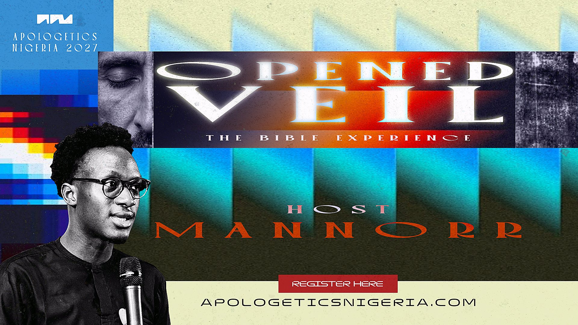
An event page is masterbrand with a light touch: its key art blended in at the top, the side’s light, and the side’s accent on italic turns (Opened Veil: cool, #C8D2E0). The event’s own type stays in its artwork.
Decks
No filler slides, verified citations only, the opposing view steelmanned on its own slide before the response.
13 · Tokens
Every value in this guide comes from assets/css/v3-tokens.css. The website stylesheet and the printed profile both read it; nothing else declares a token.
@font-face{font-family:"Newsreader";src:url(../fonts/newsreader.woff2) format("woff2-variations");font-weight:200 800;font-style:normal;font-display:swap}
@font-face{font-family:"Newsreader";src:url(../fonts/newsreader-italic.woff2) format("woff2-variations");font-weight:200 800;font-style:italic;font-display:swap}
@font-face{font-family:"Jost";src:url(../fonts/jost.woff2) format("woff2-variations");font-weight:100 900;font-style:normal;font-display:swap}
@font-face{font-family:"Oswald";src:url(../fonts/oswald-600.woff2) format("woff2");font-weight:600;font-display:swap}

:root{
  --ink:#111214; --ink-2:#17181B; --ink-3:#1E2023;
  --paper:#F2EFEA; --soft:#C9CCCF; --mute:#A9AEB3; --faint:#8C9298;
  --line:rgba(242,239,234,.12); --line-2:rgba(242,239,234,.32); --line-3:rgba(242,239,234,.6);
  --glass:rgba(255,255,255,.035);
  --warm:rgba(122,84,52,.30); --cool:rgba(48,70,104,.34);
  --err:#F0B8B1; --ok:#BFD8C4;
  --f-serif:"Newsreader","Iowan Old Style",Palatino,Georgia,serif;
  --f-sans:"Jost","Futura","Century Gothic",system-ui,sans-serif;
  --f-cond:"Oswald","Impact","Arial Narrow",sans-serif;
  --gutter:clamp(16px,4vw,56px);
  --max:1360px;
  --r-card:22px; --r-panel:28px;
  color-scheme:dark;
}

/* Print ground: PDF viewers and paper flatten the light, so print runs it a step stronger. */
@media print{
  :root{--line:rgba(242,239,234,.13); --warm:rgba(122,84,52,.36); --cool:rgba(48,70,104,.40)}
}
Changing a value
14 · Open items
An honest list of places that do not yet follow this guide, as of October 2026.
#E3C9A4 and #C8D2E0 are written by hand in v3.css and the profile. Waiting on approval to become --accent and --accent-cool.
Every page sets theme-color to #040C0E; v3 ink is #111214. Phones tint their status bar a shade off the page.
Form fields draw a 22% paper edge, about 2:1 against their fill. Labels sit outside so the forms remain usable, but WCAG 1.4.11 asks for 3:1. --line-3 at rest would fix it.
The profile sizes logo.png by its padded canvas, so the mark prints at about 1.5mm in the running foot and 2.7mm on the cover, under the 3mm floor. Swapping in the trimmed logo-mark file at 3mm fixes it.
Home, Resources, Events and Partner now carry their own v3 cards (og-home.jpg, og-resources.jpg, og-events.jpg, og-give.jpg). Every other page still falls back to og-image.png, which uses the v2 gold accent, an em dash and the .org address.
The Defending the Faith 2026 pack keeps its original identity on purpose. It was sent to registrants; it is a record, not a template.